(04) MAUER. (2018) PROJET ÉTUDIANT. (TYPE) TYPOGRAPHIE & DESIGN GRAPHIQUE.
(AVEC) S. PAGÈS, C. TOURNEUX, C. SALAÜN, C. REYGROBELLET.
(AVEC) S. PAGÈS, C. TOURNEUX, C. SALAÜN, C. REYGROBELLET.
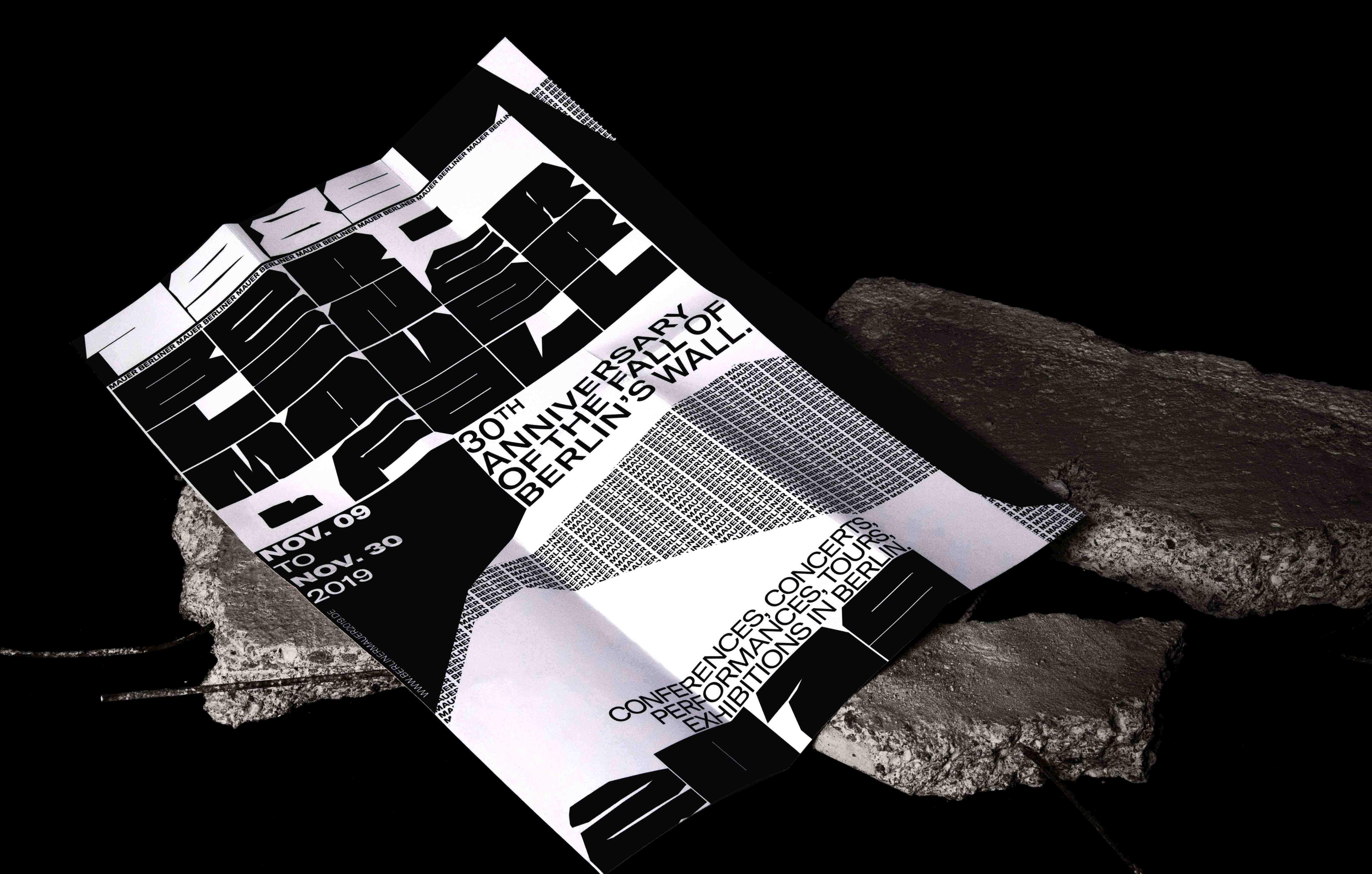
Mauer est une police de caractères dessinée avec comme inspiration la période de 1961 à 1989 à Berlin. Elle propose à travers son dessin une représentation typographique du Mur de Berlin et de sa chute; avec des caractères monospace à forte graisse. Mauer est conçu en particulier pour des éléments de titrage, ses trois variantes Mauer 1961 - Mauer 1989 et Mauer 2019 -, permettent de créer avec leur poids un large contraste dans une mise en page. Cette typographie a été imaginée et construite spécialement pour la célébration des 30 ans de la chute du Mur de Berlin en 2019.
Mauer is a font family inspired by Berlin and the wall that separated this city in two between 1961 and 1989. The family includes three variations of display fonts, - Mauer 1861, Mauer 1989 and Mauer 2019 - all composed of extended and all-caps, massive characters, based on the history of the wall. This font family was conceived specifically for titles with a strong contrast. This font family was thought specifically for the 30th commemoration of the fall of the Berlin Wall, that will be held November 2019.